
Modelling customer churn - Part 2
The first of this series of posts introduced the concept of customer churn as time-to-event process, and carried out some preliminary data exploration, and survival analysis for the Telco customer dataset from IBM.
In this second post I’m going to move on to fitting some classification models to the dataset to see how well we can predict which customers are at risk of churning based on the information we have about them.
Assuming you’re continuing from last time, you should have a cleaned data frame with 20 covariates in addition to the class variable “Churn”:
head(df.tel[,1:11], n=3)
customerID gender SeniorCitizen Partner Dependents tenure PhoneService MultipleLines InternetService OnlineSecurity OnlineBackup
1 7590-VHVEG Female             0     Yes         No      1           No    No service             DSL             No          Yes
2 5575-GNVDE   Male             0      No         No     34          Yes            No             DSL            Yes           No
3 3668-QPYBK   Male             0      No         No      2          Yes            No             DSL            Yes          Yes

head(df.tel[,12:21], n=3)
DeviceProtection TechSupport StreamingTV StreamingMovies Contract PaperlessBilling     PaymentMethod MonthlyCharges TotalCharges Churn
1               No          No          No              No    Month              Yes Electronic\ncheck          29.85            1    No
2              Yes          No          No              No One year               No     Mailed\ncheck          56.95           34    No
3               No          No          No              No    Month              Yes     Mailed\ncheck          53.85            2   Yes
Last time, we saw that the first covariate is an ID number which we can discard. We also saw that “TotalCharges” was just a proxy for tenure, so that too can be discarded.
df.tel=df.tel[,c(2:19, 21)]
We also saw that contract had the largest effect on churn rate, and that the curves were discontinuous over the contract expiry time. Therefore, it may be helpful to include contract expiry as an additional predictor. (Note that when fitting a predictive model you should ideally split your data then carry out feature engineering using only the training set).
df.tel$contract_expired=F
df.tel$contract_expired[which(df.tel$Contract=="Month" & df.tel$tenure>=1)]=T
df.tel$contract_expired[which(df.tel$Contract=="One year" & df.tel$tenure>=12)]=T
df.tel$contract_expired[which(df.tel$Contract=="Two year" & df.tel$tenure>=24)]=T
We should also check for class imbalance, since it is likely that the numbers churned and not churned are unequal:
table(df.tel$Churn)/nrow(df.tel)

       No       Yes
0.7346301 0.2653699
We see 27% of customers churned, so there is some class imbalance, but it is not extreme.(You can read more about techniques to correct class imbalance here). For imbalances at a rate of around 0.1 or lower we would need to consider techniques to address the imbalance when fitting models. For now, we’ll use the data as it is.
Next we load the caret library and split our data into training and test sets:
library(caret)
seed = 7
set.seed(seed)
train_index=createDataPartition(df.tel$Churn, p=0.8, list=F)
train_data=df.tel[train_index,c(1:18,20,19)]
test_data=df.tel[-train_index,c(2:18,20,19)]
Caret offers a huge range of models to choose from, many with sophisticated regularisation features. Here, I’ll compare three models: 1) Naive Bayes (simple model we started to explore via plots last time), 2) GLMnet, a linear method: logistic regression with lasso or elastic net regularisation, and 3) Random forest, a non-linear method with regularisation via tree depth.
Note that we mainly have categorical predictors, which Caret will automatically convert to dummy variables (a single binary variable for each category value) during fitting.
I prefer to use the area under the ROC curve as the performance metric so I set this up ready for fitting, also specifying repeated cross validation with 10 folds and repeated 3 times in order to fit the reglularization parameters.
control = trainControl(method="repeatedcv", number=10, repeats=3,
                       summaryFunction=twoClassSummary, classProbs=TRUE)

metric = "ROC"
preProcess=c("center", "scale")
Fit the three methods to the training set. Note the random forest model is slow due to the cross-validation, so if you have problems reduce the number of repeats or use a smaller training set.
# GLMNET - logistic regression with regularisation
set.seed(seed)
fit.glmnet <- train(Churn~., data=train_data, method="glmnet", metric=metric, preProc=preProc, trControl=control)
# Naive Bayes
set.seed(seed)
fit.nb <- train(Churn~., data=train_data, method="nb", metric=metric, preProc=preProc, trControl=control)
# Random Forest
set.seed(seed)
fit.rf <- train(Churn~., data=train_data, method="rf", metric=metric, preProc=preProc, trControl=control)
Compare performance on the test set using ROC area under the curve. To get full predictive power from the classifier it’s important to get the probability from the predictions, and not just use the raw results which will predict a binary response based on probabilities above or below 0.5. The pROC library also gives an estimate of the 95% confidence interval on the ROC using bootrap resampling.
library(pROC)
compare=data.frame()
rocs=list()
i=1
for (name in c("glmnet", "nb", "rf"))
{
  fit = get(paste0("fit.",name))
  predictions=predict(fit, test_data, type="prob")
  roc.obj=roc(test_data$Churn=="Yes", predictions$Yes)
  aucval=auc(roc.obj)[1]
  compare=rbind(compare, data.frame(model=name, auc=auc(roc.obj)[1],
                                                auc.lci95=ci.auc(roc.obj)[1],
                                                auc.uci95=ci.auc(roc.obj)[3]))
  rocs[[i]]=roc.obj
  i=i+1
}
print(compare, digits=3)
model   auc auc.lci95 auc.uci95
1 glmnet 0.836     0.813     0.858
2     nb 0.810     0.784     0.835
3     rf 0.814     0.789     0.840
Using the pROC library, we can also plot the ROC curve for the three models, which shows 1-specificity, or the false positive rate (x), plotting against the sensitivity or hit rate (y). The black line shows the performance expected if the forecast consisted of the same probability for all customers, which would give a ROC area of 0.5. A perfect forecast would have a false positive rate of zero (specificity of 1) and a sensitivity of 1: all the data points would be clustered at (1,1) on the plot, giving a ROC area of 1. Therefore the greater the area between the black line and the ROC curve for each model, the more skilful the prediction from that particular model.
ggroc(rocs)+scale_color_discrete("model", labels=modelnames)+theme_bw()+
  geom_segment(data=data.frame(x=1, y=0, xend=0, yend=1),
               aes(x=x, y=y, xend=xend, yend=yend), color='black')
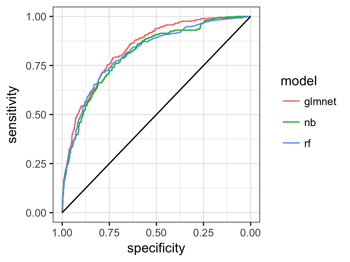
So the regularised logistic regression model GLMnet comes out top, and performs better than the simplest (unregularised) Naive Bayes method but also better than the Random Forest model. We also see from the overlap of the confidence intervals and the ROC plot that there is not so much difference between the models, but glmnet does look a little better. The ROC area tells us the probability that, two randomly selected customers, one from each category, the probability that the classification model will assign the greater probability of churn to the one that did in fact churn. So, for our best model this ability to distingiush churned customers is around 0.84, and this is significantly better than a non-informative forecast (AUC of 0.5) at 95% confidence.
We can use the caret function “learing_curve_data” to plot the learning curve for the models, to tell us if we’d expect a better fit with more data. Let’s do this for the GLMnet model:
# Get dummy predictor vars first
dmy = dummyVars(" ~ .", data = train_data[,1:(ncol(train_data)-1)])
dmy.df = data.frame(predict(dmy, newdata = train_data))
dmy.df=cbind(dmy.df, data.frame(Churn=factor(train_data$Churn)))
lcd=learing_curve_dat(dat=dmy.df,
                      outcome="Churn",method="glmnet",
                      metric=metric, trControl=trainControl(
                        classProbs=T, summaryFunction = twoClassSummary))

ggplot(lcd, aes(x = Training_Size, y = ROC, color = Data)) +
  geom_smooth(method = loess, span = .8) +
  theme_bw()
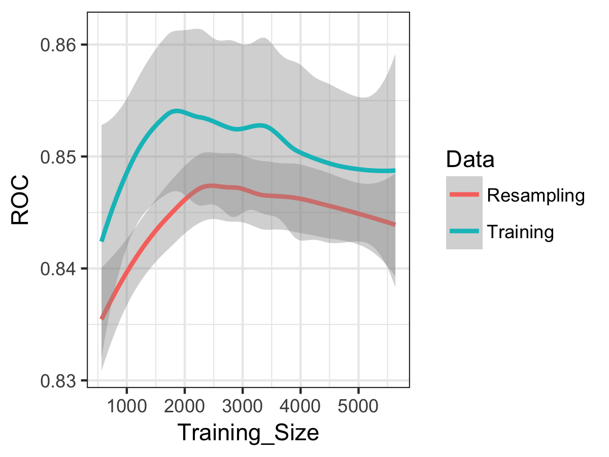
We see that error in the model is increasing (i.e. ROC decreases), and the training and resampling errors are changing roughly in parallel. So the model is suffering from bias rather than variance, and more data (from the same distribution) would not likely produce a better-performing and generalisable model. For more on learning, curves, I’d recommend the useful notes here.
Finally, let’s examine the best model fit a little more. For the glmnet model, the coefficients show us the direction of the effect on the churn probability: positive coefficients mean an increased probability of churn and negative coefficients a decreased probability of churn. We can also extract the variable importance from the model fit and rank the predictors.
coeff=predict(fit.glmnet$finalModel, type = "coefficients",
                            s=fit.glmnet$bestTune$lambda)
coeff
(Intercept)                    -1.599677889
genderMale                      .
SeniorCitizen1                  0.048102160
PartnerYes                     -0.007105372
DependentsYes                  -0.078127959
tenure                         -0.813825921
PhoneServiceYes                -0.067878763
MultipleLinesNo service         0.049543026
MultipleLinesYes                0.126742101
InternetServiceFiber optic      0.474371645
InternetServiceNo              -0.043437030
OnlineSecurityNo service       -0.043160968
OnlineSecurityYes              -0.133554832
OnlineBackupNo service         -0.043969565
OnlineBackupYes                -0.029928087
DeviceProtectionNo service     -0.046420652
DeviceProtectionYes             .
TechSupportNo service          -0.046329617
TechSupportYes                 -0.150521863
StreamingTVNo service          -0.046892263
StreamingTVYes                  0.101179746
StreamingMoviesNo service      -0.042586260
StreamingMoviesYes              0.119301524
ContractOne year               -0.253784260
ContractTwo year               -0.516323995
PaperlessBillingYes             0.137929191
PaymentMethodCredit\ncard      -0.012673556
PaymentMethodElectronic\ncheck  0.172840007
PaymentMethodMailed\ncheck      .
MonthlyCharges                  .
contract_expiredTRUE            0.139496261

varImp(fit.glmnet)
glmnet variable importance

  only 20 most important variables shown (out of 30)

                               Overall
tenure                         100.000
ContractTwo year                63.444
InternetServiceFiber optic      58.289
ContractOne year                31.184
PaymentMethodElectronic\ncheck  21.238
TechSupportYes                  18.496
contract_expiredTRUE            17.141
PaperlessBillingYes             16.948
OnlineSecurityYes               16.411
MultipleLinesYes                15.574
StreamingMoviesYes              14.659
StreamingTVYes                  12.433
DependentsYes                    9.600
PhoneServiceYes                  8.341
MultipleLinesNo service          6.088
SeniorCitizen1                   5.911
StreamingTVNo service            5.762
DeviceProtectionNo service       5.704
TechSupportNo service            5.693
OnlineBackupNo service           5.403
So 30 variables were retained in the model, with the five most important being tenure (decrease probability of churning), contract of two years (decrease probability of churning), fiber optic internet (increase probability of churning) contract of one year (decrease probability of churning) and payment method of electronic check (increase probability of churning).
At this point, you might want to check these results against the IBM analysis using Watson Analytics. They find “Contract, Internet Service, Tenure, and Total Charges are the most important factors,” exactly as we have found, although they don’t appear to have spotted that Total Charges and Tenure are exactly the same thing, which just shows you should always plot your raw data!
This classification analysis has moved us beyond simply identifying risk factors to quantifying the predictive power of the covariate information held on customers in terms of indentifying those at risk of churning. However, with this simple approach we are predicting who is at risk of churning for the time snapshot of the dataset. In reality, if we are to take action based on model predictions, we need a prediction of churn risk which is a function of both invariant customer characteristics, and time. This is a more challenging problem which I’ll return to discuss in the third and final post in this series.
Leave a Comment