
Modelling customer churn - Part 1
Customer churn is the loss of customers or clients and is an example of a ‘time-to-event’ process: in this case the event is when the customer leaves, for example by terminating their contract. Other examples of events like these which we might want to understand are included human mortality, employee attrition and the failure of engineering components, and the same basic modelling methods can be used in all of them. So not only is it cool that the same maths can be used for such diverse applications, it’s potentially a very valuable topic to understand!
In this series of posts, I’m going to analyse the Telco customer churn dataset available from IBM here.
In this first post I’m going to do some survival analysis and preliminary data exploration and visualisation, to try and understand which are the most important factors affecting customer churn in this dataset. In the next post I’ll demonstrate how to build a classification model to predict customer churn for this dataset. Finally, in the third and final post I’ll consider how you might create and customer churn forecast and how useful such a forecast might be for a business.
First, load libraries and data.
# data handling utilities
library(data.table)
library(dplyr)
library(tidyr)
library(purrr)
# plotting
library(ggplot2)
# survival fitting and plotting
library(survival)
library(survminer)
# Load the TELCO customer churn data from .csv file converted from the downloaded file:
df.tel=fread("./data/WA_Fn-UseC_-Telco-Customer-Chur-Table 1.csv", data.table=F)

head(df.tel[,1:11])

 customerID gender SeniorCitizen Partner Dependents tenure PhoneService MultipleLines InternetService OnlineSecurity OnlineBackup
1 7590-VHVEG Female             0     Yes         No      1           No    No service             DSL             No          Yes
2 5575-GNVDE   Male             0      No         No     34          Yes            No             DSL            Yes           No
3 3668-QPYBK   Male             0      No         No      2          Yes            No             DSL            Yes          Yes
4 7795-CFOCW   Male             0      No         No     45           No    No service             DSL            Yes           No
5 9237-HQITU Female             0      No         No      2          Yes            No     Fiber optic             No           No
6 9305-CDSKC Female             0      No         No      8          Yes           Yes     Fiber optic             No           No

head(df.tel[,12:21])

DeviceProtection TechSupport StreamingTV StreamingMovies Contract PaperlessBilling     PaymentMethod MonthlyCharges TotalCharges Churn
1               No          No          No              No    Month              Yes Electronic\ncheck          29.85            1    No
2              Yes          No          No              No One year               No     Mailed\ncheck          56.95           34    No
3               No          No          No              No    Month              Yes     Mailed\ncheck          53.85            2   Yes
4              Yes         Yes          No              No One year               No   Bank\ntransfer           42.30           45    No
5               No          No          No              No    Month              Yes Electronic\ncheck          70.70            2   Yes
6              Yes          No         Yes             Yes    Month              Yes Electronic\ncheck          99.65            8   Yes
This sample data from IBM gives information about a set of customers for a fictious telecommunications business, indicating the length of time they’ve been a customer, (“tenure”, in months), if they left the service within the last month (“Churn” - a binary variable) together with 18 other covariates describing each customer.
Next, tidy up the potential predictor variables. The first column is a customer ID which we will not need.
df.vars<-df.tel[,2:20]
df.vars$SeniorCitizen=as.factor(df.vars$SeniorCitizen)
# shorten some strings and tidy up resulting data frame
df.vars <- as.data.frame(lapply(df.vars, function(x) { gsub("No phone service", "No service", x)}), stringsAsFactors = F)
df.vars <- as.data.frame(lapply(df.vars, function(x) { gsub("No internet service", "No service", x)}),stringsAsFactors = F)
df.vars <- as.data.frame(lapply(df.vars, function(x) { gsub("Month-to-month", "Month", x)}),stringsAsFactors = F)
df.vars <- as.data.frame(lapply(df.vars, function(x) { gsub("\\(automatic\\)", "", x)}),stringsAsFactors = F)
df.vars <- as.data.frame(lapply(df.vars, function(x) { gsub("Mailed check", "Mailed\ncheck", x)}),stringsAsFactors = F)
df.vars <- as.data.frame(lapply(df.vars, function(x) { gsub("Credit card", "Credit\ncard", x)}),stringsAsFactors = F)
df.vars <- as.data.frame(lapply(df.vars, function(x) { gsub("Bank transfer", "Bank\ntransfer", x)}),stringsAsFactors = F)
df.vars <- as.data.frame(lapply(df.vars, function(x) { gsub("Electronic check", "Electronic\ncheck", x)}),stringsAsFactors = T)

df.vars$tenure=as.integer(as.character(df.vars$tenure))
df.vars$MonthlyCharges=as.numeric(as.character(df.vars$MonthlyCharges))
df.vars$TotalCharges=as.numeric(as.character(df.vars$tenure))

# Check for missing values
sum(is.na(df.vars))

# Nothing appears to be missing, so copy back
df.tel[,2:20]=df.vars
Let’s plot a summary of each variable, first the numeric ones and then the categorical ones
df.tel %>%
  keep(is.numeric) %>%
  gather() %>%
  ggplot(aes(x=value,fill=key)) +
  facet_wrap(~ key, scales = "free") +
  geom_histogram()+theme_bw()
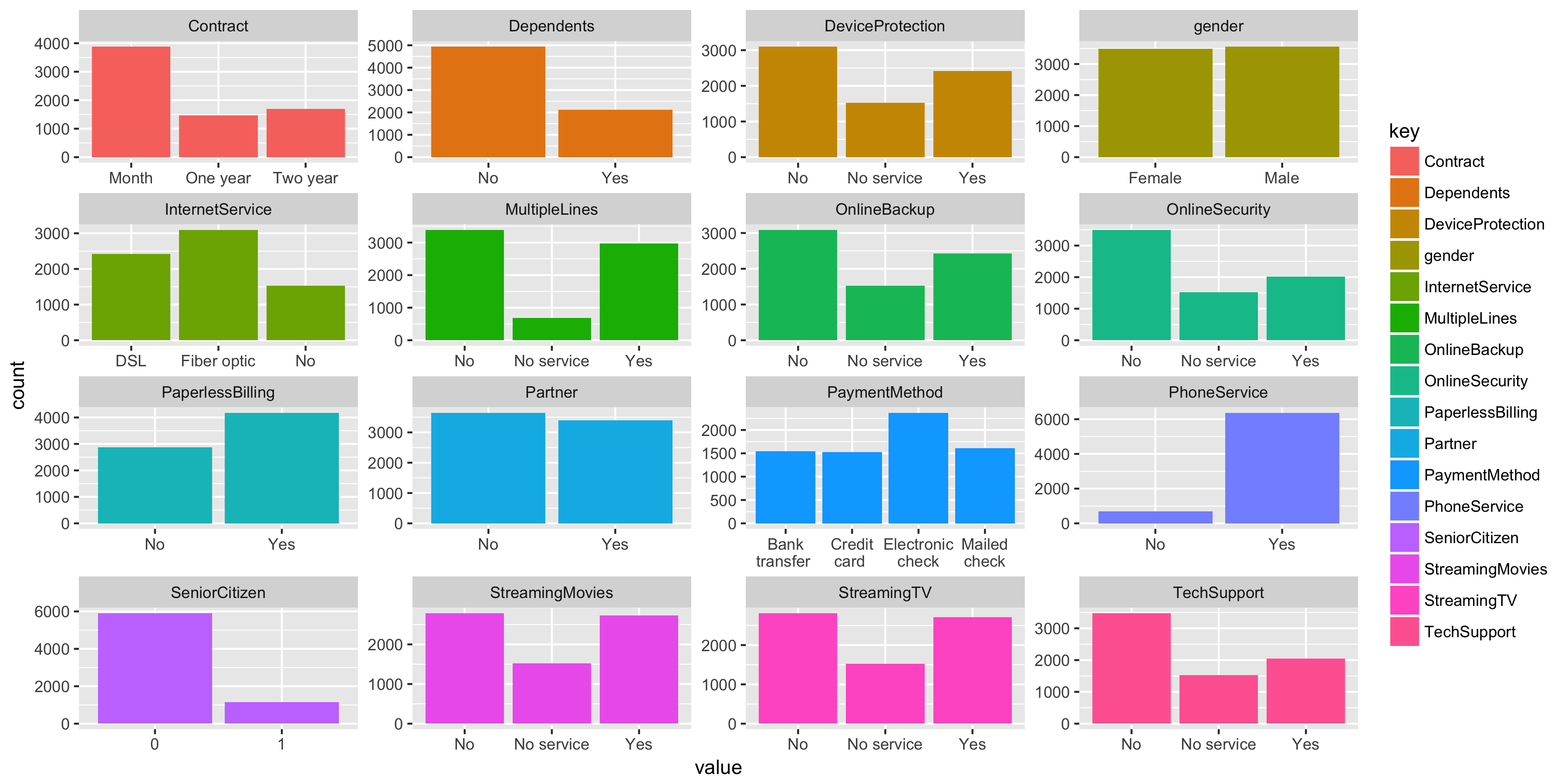
So we have 16 categorical variables, some of which are likely to overlap. Our dataset is fairly evenly gender balanced and most customers have a phone service and are not senior citizens.
df.tel %>%
  keep(is.factor) %>%
  gather() %>%
  ggplot(aes(x=value,fill=key)) +
  facet_wrap(~ key, scales = "free") +
  geom_bar()
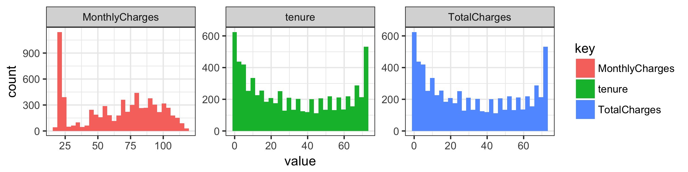
Monthly charges look to be a composite of three distributions and total charges seems to just replicate tenure.
Survival analysis
Survival analysis is concerned with any “time-to-event” phenomena in a population, where the time to the event of interest is treated as a random variable. A relatively straightforward mathematical derivation shows that the proportion of the population who survive as a function of time, the survival function, is 1 minus the cumulative distribution function for the time. Note that, in the simplest case, if the instantaneous risk of the event occurring is constant in time, the survival function would be an exponential decay curve. The survival function is useful because we can use it to calculate the probability that any individual survives beyond a specific time, i.e. the probability that the event of interest does not occur.
A complication of survival analysis is that data are typically incomplete; we may have data recorded over a certain period, and therefore do not follow all individuals in the dataset until the event occurs for them. For these individuals, the times are “right-censored,” which means that we know the time-to-event is greater than a certain length of time, but not exactly how long it is. But knowing these individuals have not yet (in this case) churned, is informative, and discarding them from the analysis might bias our results.
Luckily, the Kaplan-Meier estimator provides a method of including information for both those individuals for which we have a record of the event occurring, and those for which we only have right-censored data.
To better understand exactly how the K-M estimator works, I’d recommend working through the simple and nice examples presented here and here. Kaplan-Meier is not the only method for surivial analysis, and requires exact times, but has the advantage of being non-parametric; it is fitted empirically without making any assumptions about the distribution of the data.
Let’s plot a quick K-M survival curve on all the data.
Create a “survival object” for each observation as a function of tenure
df.tel$survival <- Surv(df.tel$tenure, df.tel$Churn == "Yes")
fit <- survfit(survival ~ 1, data = df.tel)

ggsurvplot(fit, data=df.tel, risk.table=T, conf.int = T,
           break.time.by=12, ggtheme=theme_bw(),
           censor.shape=124, conf.int.alpha=0.8,
           ylim=c(0.5,1.0),xlab='Tenure (months)',ylab='Probability of remaining')
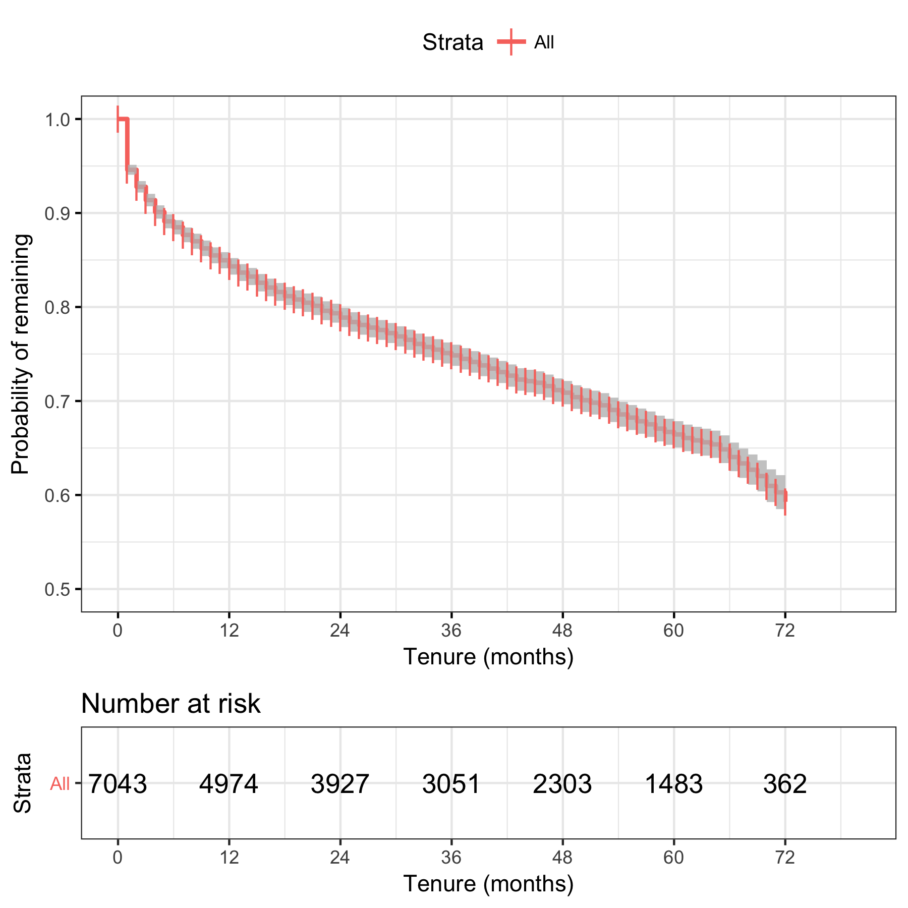
We see that, for the population as a whole, around 85% survive to a tenure of 12 months without churning. Between around 12 and 66 months, we see what looks like a linear decay with tenure, of about 5% per 12 months, and then a steeper decay after that.
Next, we want to understand how the suvival curve varies according to the covariates For example, we can fit separate curves for customers who are senior citizens and those who are not.
fit2 <- survfit(survival ~ SeniorCitizen, data = df.tel)
ggsurvplot(fit2, data=df.tel, risk.table=T, conf.int = T,
           break.time.by=12, ggtheme=theme_bw(),
           censor.shape=124, conf.int.alpha=0.3,
           ylim=c(0.5,1.0),xlab='Tenure (months)',ylab='Probability of remaining')
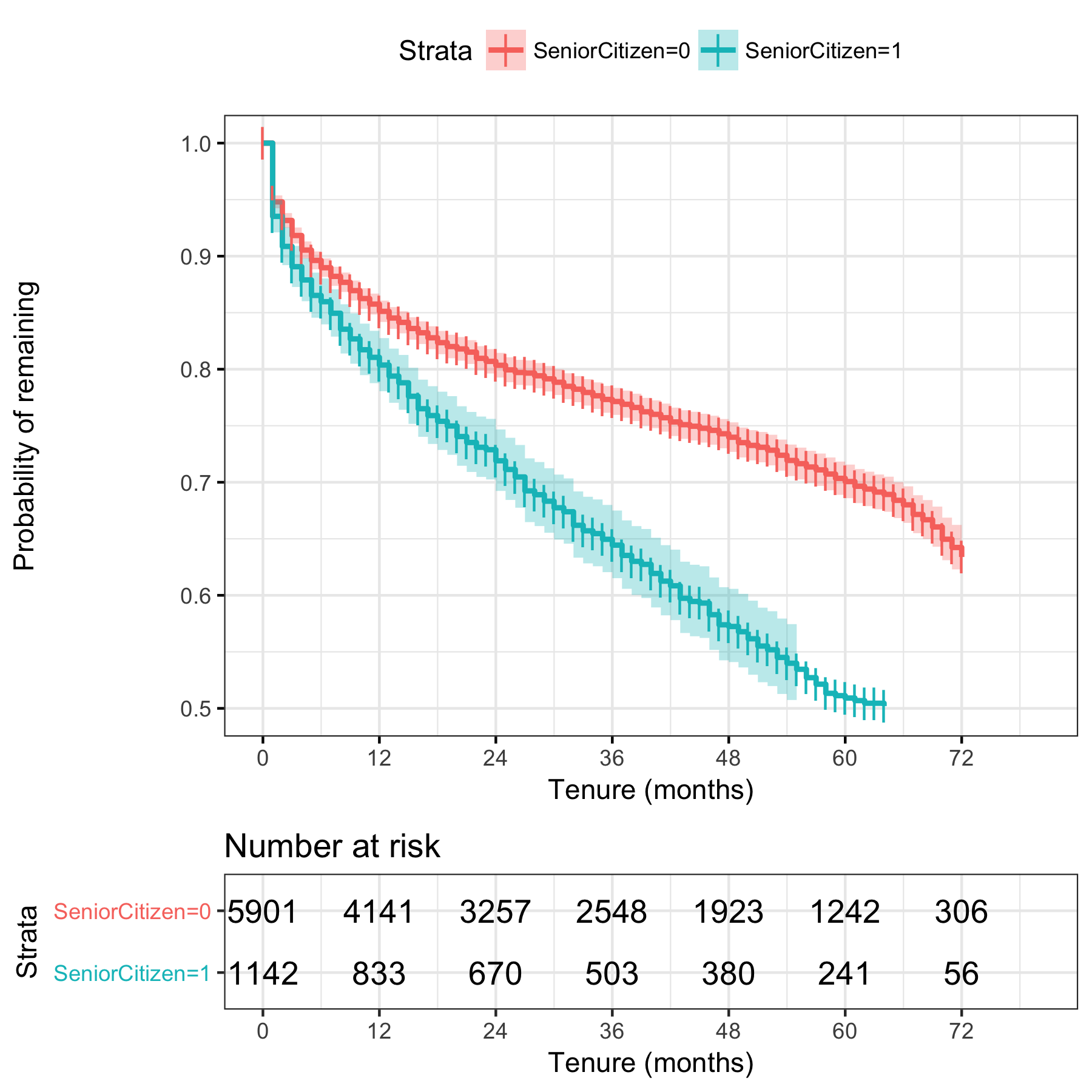
We see that senior citizens churn more quickly than other customers. To determine if the rates are significantly different, we can use the p-value obtained from the Log Rank test, which gives us the probability of obtaining these results if there was no difference in churn between populations who are senior citizens and those who are not.
survdiff(survival ~ SeniorCitizen, data = df.tel)
Call:
survdiff(formula = survival ~ SeniorCitizen, data = df.tel)

                   N Observed Expected (O-E)^2/E (O-E)^2/V
SeniorCitizen=0 5901     1393     1560      17.8       109
SeniorCitizen=1 1142      476      309      89.8       109

 Chisq= 110  on 1 degrees of freedom, p= 0
So, as we might expect from the survival curves there is a significant difference between the populations divided according to this category, and in fact p is so low it’s reported as zero. But how much faster do senior citizens churn than the rest of the population?
To answer this we can turn to another traditional survival analysis technique, the Cox proportional hazards model, which is a regression method to quantify how hazard rates (the churn rate in this example) vary across covariates.
fit.cox<-coxph(survival~SeniorCitizen, data=df.tel)
fit.cox
Call:
coxph(formula = survival ~ SeniorCitizen, data = df.tel)

                 coef exp(coef) se(coef)    z      p
SeniorCitizen1 0.5474    1.7287   0.0531 10.3 <2e-16

Likelihood ratio test=96.6  on 1 df, p=0
n= 7043, number of events= 1869
Here, we see that the p values for the SeniorCitizen category is statistically significant, and that the churn rate coefficient multiplier, exp(coef) is 1.73, indicating senior citizens churn at a rate 1.7 times faster than the population.
However, Cox regression assumes proportional hazards; that the relationship between churn rates can be represented by a linear function. If this assumption does not hold, the results may be misleading. We can test for non-proportional hazards by considering if the residuals of the regression vary with time.
cox.zph(fit.cox)
                 rho chisq        p
SeniorCitizen1 0.099  18.3 1.89e-05

plot(cox.zph(fit.cox))
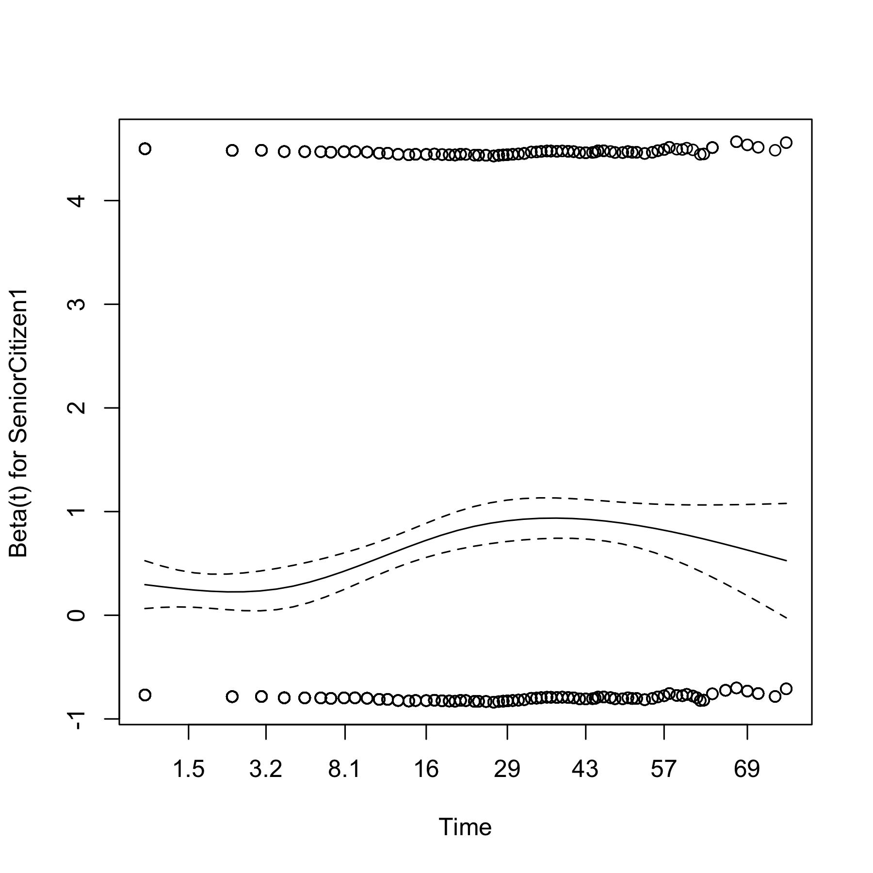
We see that the residuals are flat between approximately 1.5 to 3.2 months and around 30 to 40 months, but overall, they vary with time. The p-value of 1.89e-05 in the test here indicates that the residuals are significantly a function of tenure,and that consequently the proportional model does not apply. For this dataset, it turns out that the proportional hazards assumption is violated for many of the potential predictors, and that therefore this approach is of limited use.
What else can we say about the covariates? At this stage in data exploration I always condone taking the simplest possible approach. In this case we can fit K-M curves for each categorical covariate in turn.
vars.cat=colnames(df.vars %>%keep(is.factor))
log.rank.cat=data.frame()
for(icat in 1:length(vars.cat))
{
  diff=survdiff(formula = as.formula(paste('survival ~' , vars.cat[icat], sep='')), data = df.tel)
  p=pchisq(diff$chisq, df=(length(unique(df.tel[,vars.cat[icat]])))-1, lower.tail=F)
  tmp=data.frame(variable=vars.cat[icat], chisq=diff$chisq, p=p)
  log.rank.cat=rbind(log.rank.cat, tmp)
}
Now, order by p value, from most to least significant.
log.rank.cat[order(log.rank.cat$p, decreasing = F),]
           variable        chisq             p
14         Contract 2352.8725383  0.000000e+00
8    OnlineSecurity 1013.8648560 6.950945e-221
11      TechSupport  989.5601462 1.317481e-215
16    PaymentMethod  865.2394631 3.066529e-187
9      OnlineBackup  821.3388247 4.451848e-179
10 DeviceProtection  763.5064141 1.609492e-166
7   InternetService  520.1206082 1.140893e-113
3           Partner  423.5430816  4.132951e-94
13  StreamingMovies  378.4261518  6.695842e-83
12      StreamingTV  368.3074319  1.054526e-80
4        Dependents  232.6990417  1.537238e-52
15 PaperlessBilling  189.5114861  4.064094e-43
2     SeniorCitizen  109.4896934  1.267619e-25
6     MultipleLines   30.9690356  1.884340e-07
1            gender    0.5257070  4.684174e-01
5      PhoneService    0.4308186  5.115875e-01
So all covariates with the exception of gender and PhoneService produce curves which are significantly different amongst categories at <1%, with Contract, OnlineSecurity and TechSupport having the most signficant effects on churn rate. Let’s look at the survival curves for Contract:
fit3 <- survfit(survival ~ Contract, data = df.tel)
ggsurvplot(fit3, data=df.tel, risk.table=F, conf.int = T,
           break.time.by=12, ggtheme=theme_bw(),
           censor.shape=124, conf.int.alpha=0.3,
           break.x.by=1,
           ylim=c(0.5,1.0),xlab='Tenure (months)',ylab='Probability of remaining')
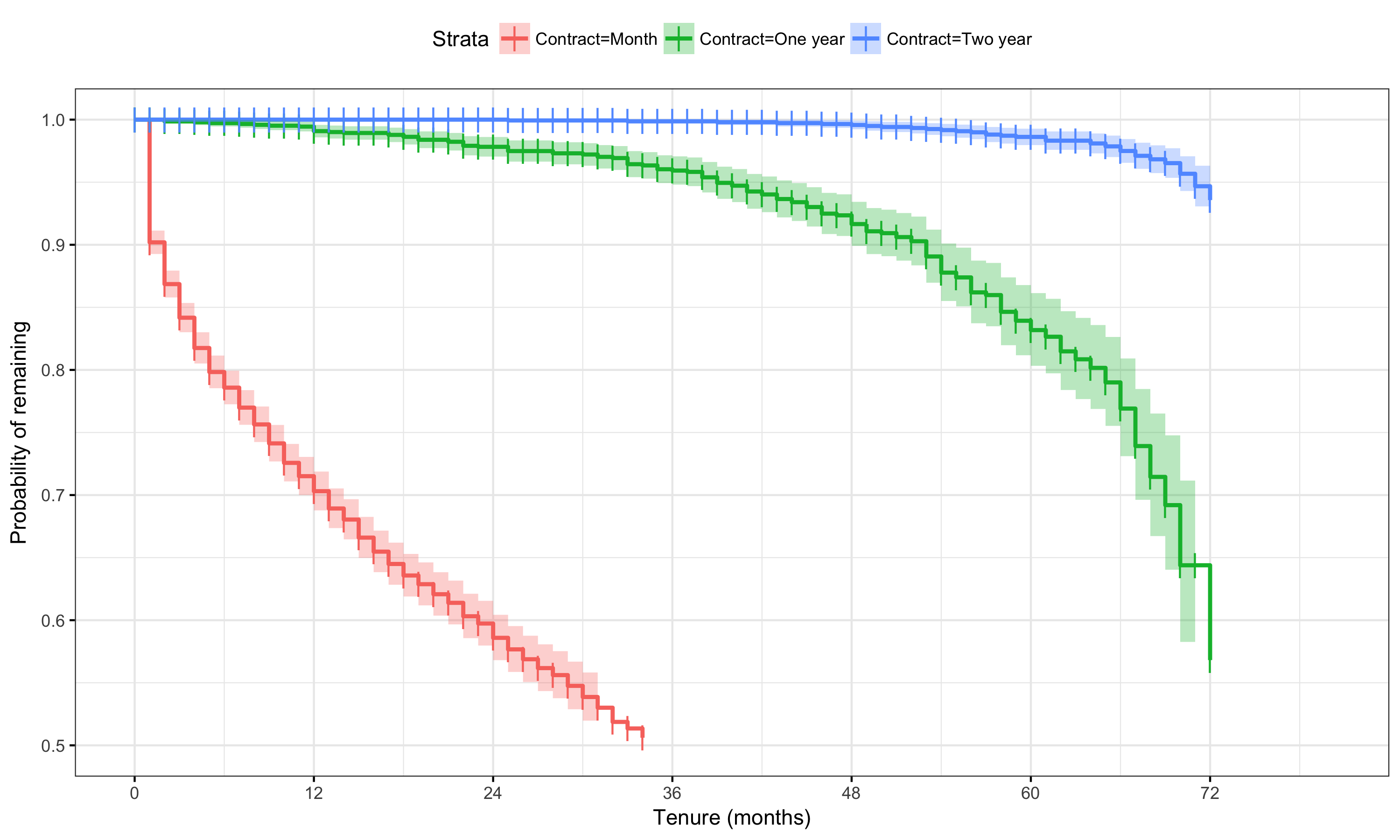
Yes, the effect there certainly appears to be large for montly customers, with a 10% churn after just one month. Customers on one and two year contracts churn much more sedately.
What about the numerical variables?
coxph(formula = survival ~ MonthlyCharges, data = df.tel)
Call:
coxph(formula = survival ~ MonthlyCharges, data = df.tel)

                   coef exp(coef) se(coef)    z       p
MonthlyCharges 0.006158  1.006177 0.000787 7.83 4.9e-15

Likelihood ratio test=63.5  on 1 df, p=1.55e-15
n= 7043, number of events= 1869
This shows us that a $1 increase in Monthly charges increases churn slightly (by 0.6%) and this is statistically significant. It also turns out that, as we saw from the distributions, TotalCharges is just a linear function of tenure, so this covariate can be removed.
Finally, let’s take a closer look at churn probabilities for different categories, and calculate the probability of churn conditional upon category values
Use the chain rule of probability, P(Churn/A)=P(Churn, A)/P(A).
We can calculate this for each covariate and see which seems to have to largest effect.
library(plyr)
df.freq=data.frame()
for(var in vars.cat)
{
  count.all=count(df.tel[,var])
  count.churn=count(df.tel[which(df.tel$Churn=="Yes"),var])
  pchurns=count.all
  # Use match to be cautious in case some levels are missing or vars are re-ordered
  pchurns[,2]=count.churn[match(count.all$x, count.churn$x),2]/count.all[,2]
  pchurns$variable=var
  df.freq=rbind(df.freq,pchurns)
}
churn.rate=nrow(df.tel[which(df.tel$Churn=="Yes"),])/nrow(df.tel)
ggplot(df.freq)+geom_bar(aes(x=x, y=freq, fill=variable), stat='identity')+theme_bw()+
  facet_wrap(~variable, nrow=4, scales='free')+ggtitle("Conditional churn probability")+
  scale_y_continuous(limits=c(0,0.5))+
  geom_hline(yintercept = churn.rate, linetype='dashed')+
  theme(plot.title = element_text(hjust = 0.5), legend.position = 'none')+xlab('')+ylab('P(Churn/value)')
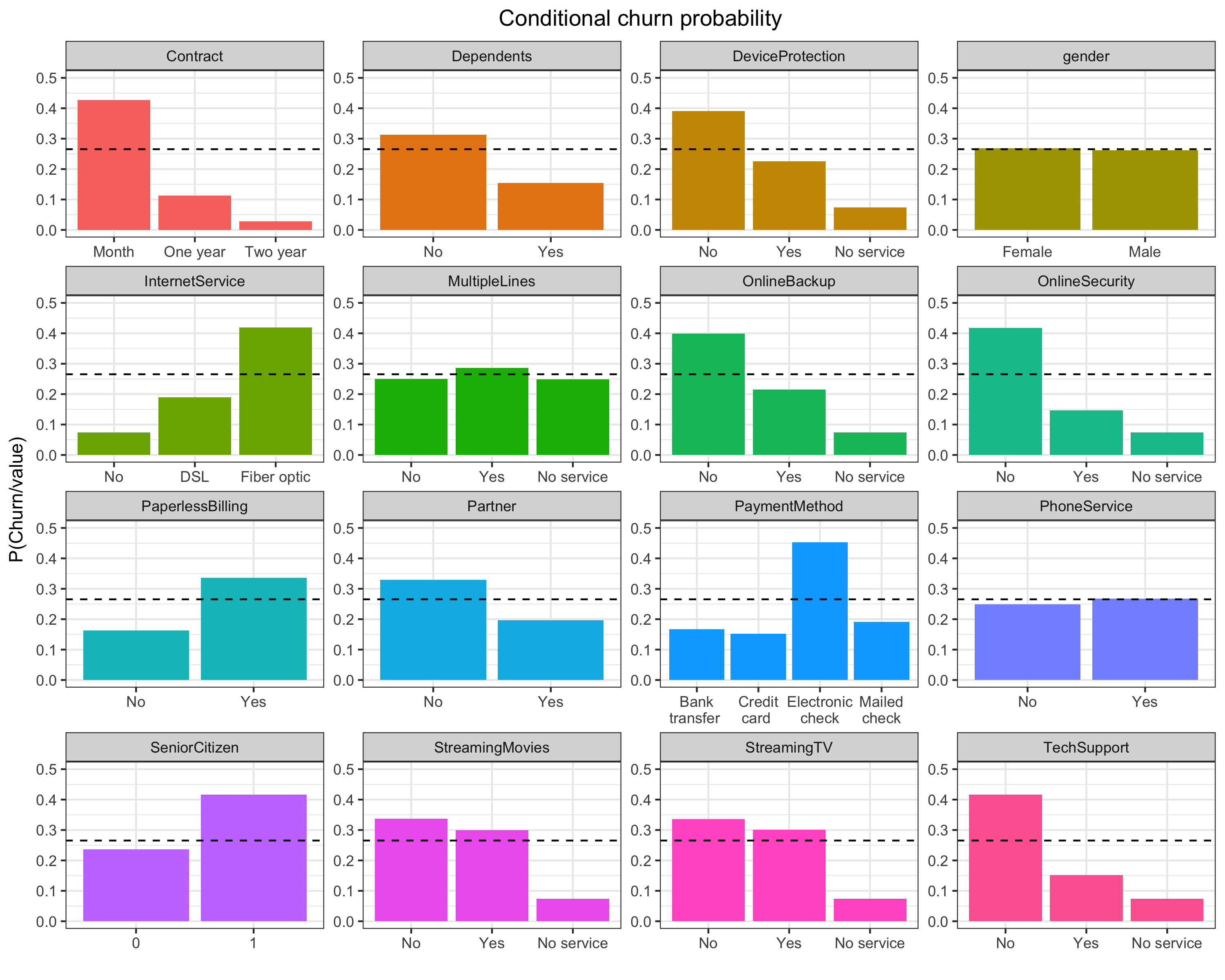
Just by inspecting the plots, we can see that the largest churn probabilities (compared to other category values) are associated with customers on monthly contracts, paying by electronic check, with no online security and no use of tech support, which are exactly the most statistically significant covariates we found in the survival analysis above. So if we want to reduce churn, we would probably want to looks at customers falling into these categories first.
In this analysis we’ve seen that by exploring the data and fitting survival curves we’ve discovered that that churn rate for this dataset is not constant but varies according to tenure, and we’ve seen which categories of customers are most likely to churn.
So we have some population-level understanding of churn for this data. But can we predict which individual customers are at highest risk of churning? You may have spotted that the conditional probabilities I’ve calculated above are exactly what is calculated in a Naive Bayes classification model. In the next post, I’ll compare a few different classfication methods to create a predictive model of customer churn.
Leave a Comment